Code - CSS and more
What Is MetaSlider?
MetaSlider is one of the most popular WordPress slider plugins. It allows you to create responsive image sliders, carousels, and slideshows with ease. Built on FlexSlider, it offers smooth transitions, customizable navigation, and compatibility with most WordPress themes.
Why Customize MetaSlider with CSS?
While MetaSlider comes with great default styling, you can make it look even better by adding custom CSS. CSS lets you:
- Change the position and size of navigation dots and arrows.
- Adjust colors to match your brand.
- Hide elements on mobile for a cleaner layout.
- Add hover effects for better user experience.
Free CSS Snippets to Improve MetaSlider
On this page, you’ll find free CSS code snippets that you can copy and paste into your WordPress site. These snippets help you:
- Style navigation dots and arrows.
- Control spacing and alignment.
- Enhance responsiveness and visual appeal.
All examples are easy to implement and include clear comments so you know exactly what each rule does.
About MetaSlider and CSS snippets to improve it
About MetaSlider – WordPress plugin
MetaSlider (also known as ml-slider on WordPress.org) is a powerful and user-friendly WordPress plugin that lets you create beautiful, responsive slideshows, carousels, and galleries in minutes. It’s recognized as one of the world’s most popular slider plugins, with over 700,000 active installations.
Key Features
- User-Friendly Interface: A clean drag‑and‑drop builder makes creating sliders intuitive—even for beginners.
- Fully Responsive & Mobile‑Ready: All slideshows automatically adapt to desktop, tablet, and mobile screens.
- Versatile Content Support: Beyond images, it supports videos, HTML layers, WooCommerce products, blog posts, and more—with the Pro version unlocking video, HTML layers, and post feeds.
- SEO Optimized: You can easily add alt text, captions, and links to improve search engine visibility.
- Multiple Slider Types & Themes: Choose from Nivo, FlexSlider, Coin Slider, and Responsive Slides; MetaSlider Pro offers even more themes and a live theme editor.
- Developer Tools: Advanced users can leverage filters, actions, and REST API support (ml-slider and ml-slide post types) to customize functionality.
Free vs. Pro
Free Version: Supports image slides, basic carousels, responsive behavior, SEO fields, multiple slider types, and Gutenberg/block editor compatibility.
Pro Version adds:
- Video slides from YouTube, Vimeo, TikTok, or local sources
- Layer slides with CSS3 animations
- Post-feed and WooCommerce product sliders
- Thumbnail/filmstrip navigation
- Timer-based slide scheduling
- Custom and premium themes plus live theme editing
- Priority support
Getting Started
- Install the plugin via Plugins → Add New, search for “MetaSlider,” install and activate.
- In the dashboard sidebar, go to MetaSlider → Create a slideshow.
- Drag and drop images (or videos/HTML for Pro), and add captions, alt text, and links.
- Select your slider type and theme.
- Copy the provided shortcode/block and insert it into any page or post.
Why Choose MetaSlider?
MetaSlider stands out for its balance of ease-of-use and advanced features. It’s ideal for beginners thanks to its intuitive interface and shortcodes, yet versatile enough for developers seeking custom integrations and REST API support. Whether you need a simple image carousel or a dynamic video slideshow, MetaSlider offers a scalable solution.
Bottom Line
MetaSlider is a leading WordPress slideshow plugin with a smooth onboarding experience, responsive design, and robust free features. The Pro version unlocks powerful enhancements like video support, layers, product integration, and customization tools—making it a solid choice for both personal and professional websites.
Change the arrows in the MetaSlider plugin
I use the MetaSlider plugin to display a slideshow on my website. While MetaSlider provides default navigation arrows, I wanted a cleaner and more minimal design that matched my brand colors. Specifically, I needed simple orange arrows instead of the standard icons.
To achieve this, I created a custom CSS solution. The CSS overrides MetaSlider’s default arrow styles and uses pseudo-elements (::after) to draw triangle-shaped arrows with CSS borders. This approach avoids using image files or icon fonts, making the design lightweight and easy to customize.
The arrows are placed inside the navigation buttons, centered using Flexbox, and slightly adjusted vertically for better alignment. The left arrow points to the previous slide, and the right arrow points to the next slide. Both arrows use the color #ff6600 to match the desired orange tone.
This CSS styles navigation arrows for the MetaSlider plugin. It uses pseudo-elements to create triangle-shaped arrows with borders and positions them inside navigation buttons. The arrows are centered and slightly adjusted vertically for better alignment.
CSS:
/* Container for navigation arrows */
.flex-direction-nav a {
  display: flex; /* Use flexbox for centering content */
  align-items: center; /* Vertically center content */
  justify-content: center; /* Horizontally center content */
  width: 60px; /* Button width */
  height: 60px; /* Button height */
  background: transparent !important; /* Remove any background */
  position: relative; /* Needed for positioning pseudo-elements */
  overflow: hidden; /* Hide overflow for clean look */
}

/* Left arrow (previous) */
.flex-direction-nav a.flex-prev::after {
  content: ""; /* Create pseudo-element */
  display: block; /* Make it visible */
  width: 0; /* No width, triangle created by borders */
  height: 0; /* No height, triangle created by borders */
  border-top: 20px solid transparent; /* Top transparent border */
  border-bottom: 20px solid transparent; /* Bottom transparent border */
  border-right: 30px solid #ff6600; /* Right border forms the arrow, orange color */
  transform: translateY(-5px); /* Move arrow 5px up for better alignment */
}

/* Right arrow (next) */
.flex-direction-nav a.flex-next::after {
  content: ""; /* Create pseudo-element */
  display: block; /* Make it visible */
  width: 0; /* No width, triangle created by borders */
  height: 0; /* No height, triangle created by borders */
  border-top: 20px solid transparent; /* Top transparent border */
  border-bottom: 20px solid transparent; /* Bottom transparent border */
  border-left: 30px solid #ff6600; /* Left border forms the arrow, orange color */
  transform: translateY(-5px); /* Move arrow 5px up for better alignment */
}
Remove the fade-in effect from the first slide in MetaSlider
This code removes the fade-in effect from the first slide in MetaSlider.
Normally, when a MetaSlider slideshow loads, the first image fades in smoothly. This snippet changes the slider settings so that the first image appears immediately without any fade transition.
It works by hooking into MetaSlider’s internal FlexSlider options.
The function sets the fadeFirstSlide option to false.
The add_filter line tells WordPress to apply this change whenever MetaSlider builds its slider parameters.
In short: it makes the first slide show instantly instead of fading in when the slider starts.
CSS:
// Disable the fade-in effect on the first slide in MetaSlider (FlexSlider engine)
function westend_remove_fade_in($options, $slider_id, $settings) {
    // Set the 'fadeFirstSlide' option to false
    $options['fadeFirstSlide'] = 'false';
    return $options; // Return the modified options array
}

// Hook into MetaSlider's FlexSlider parameters to apply the change
add_filter('metaslider_flex_slider_parameters', 'westend_remove_fade_in', 10, 3);
Customizes the navigation dots (variation A)
This CSS customizes the navigation dots (pagination indicators) in the MetaSlider plugin. It changes their position, color, size, spacing, and behavior on different screen sizes. It also hides the dots on small screens for a cleaner mobile layout.
CSS:
/* ========================================= */
/* MetaSlider: Position navigation dots over images */
/* ========================================= */
.metaslider .flex-control-nav {
    bottom: 0.7rem !important; /* Move dots slightly above the bottom edge */
}

/* ========================================= */
/* MetaSlider: Active dot styling (current slide) */
/* ========================================= */
.flex-control-paging li a.flex-active {
    background: #cf4230 !important; /* Red color for active dot */
    font-size: 120%; /* Increase size slightly (try 300% for testing) */
    width: 15px; /* Make the dot wider */
    cursor: default; /* Prevent pointer cursor on active dot */
}

/* ========================================= */
/* Hide MetaSlider dots on small screens */
/* ========================================= */
@media (min-width: 10px) and (max-width: 699px) {
    .flex-control-paging {
        display: none; /* Remove dots for mobile view */
    }
}

/* ========================================= */
/* MetaSlider: Spacing between dots */
/* ========================================= */
.metaslider .flex-control-nav li a {
    margin: 0 4px; /* Horizontal space between dots */
    padding: 0; /* Remove extra padding */
}

/* ========================================= */
/* MetaSlider: Inactive dot styling */
/* ========================================= */
.flex-control-paging li a {
    background: #AEBDEA !important; /* Light blue for inactive dots */
}

/* ========================================= */
/* MetaSlider: Hover effect on dots */
/* ========================================= */
.flex-control-paging li a:hover {
    background: #777777 !important; /* Gray color on hover */
}

/* ========================================= */
/* End of MetaSlider custom dot styling */
/* ========================================= */
MetaSlider – Customizes the navigation dots (variation B)
This CSS customizes the navigation dots (pagination indicators) in the MetaSlider plugin. It changes their position, size, colors, and spacing. It also hides the dots on small screens for a cleaner mobile layout. Active dots are styled differently from inactive ones to make the current slide stand out.
CSS:
/* ========================================= */
/* MetaSlider: Position navigation dots above the images */
/* ========================================= */
.metaslider .flex-control-nav {
    bottom: 2.7rem !important; /* Move dots slightly higher above the bottom edge */
}

/* ========================================= */
/* MetaSlider: Spacing between dots */
/* ========================================= */
.metaslider .flex-control-nav li a {
    margin: 0 3px !important; /* Horizontal space between dots */
    padding: 0; /* Remove extra padding */
}

/* ========================================= */
/* MetaSlider: Active dot styling (current slide) */
/* ========================================= */
.flex-control-paging li a.flex-active {
    background: #04aef4 !important; /* Bright blue for active dot */
    font-size: 300%; /* Increase size significantly */
    width: 11px; /* Dot width */
    height: 11px; /* Dot height */
    cursor: default; /* Disable pointer cursor on active dot */
}

/* ========================================= */
/* MetaSlider: Inactive dot styling */
/* ========================================= */
.flex-control-paging li a {
    background: #b4d25c !important; /* Green color for inactive dots */
}

/* ========================================= */
/* Hide MetaSlider dots on small screens */
/* ========================================= */
@media (min-width: 10px) and (max-width: 699px) {
    .flex-control-paging {
        display: none; /* Hide dots for mobile view */
    }
}

/* ========================================= */
/* End of MetaSlider custom dot styling */
/* ========================================= */
.
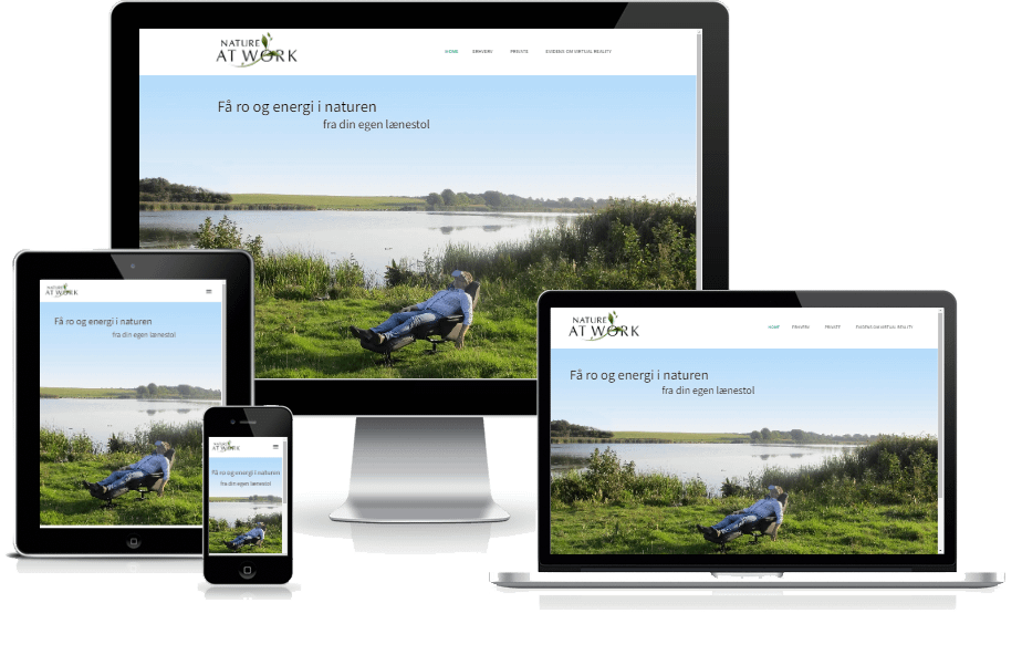

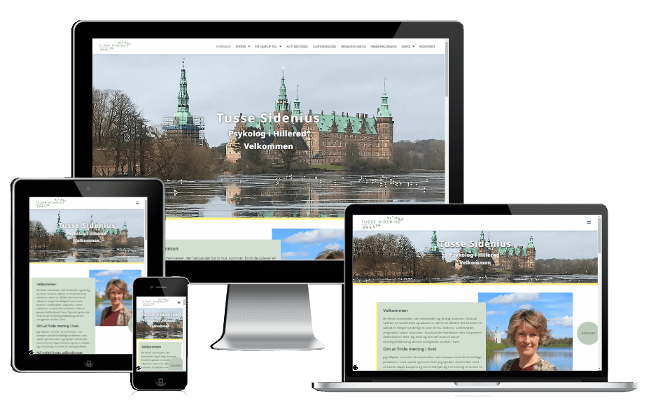
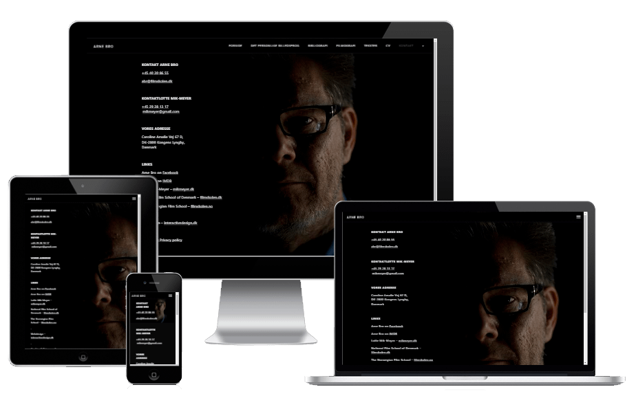
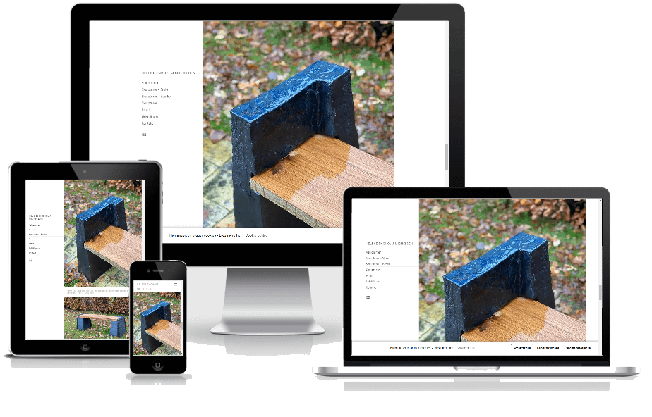
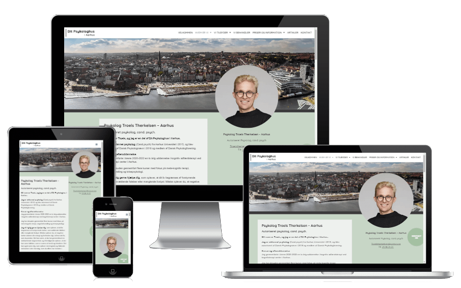
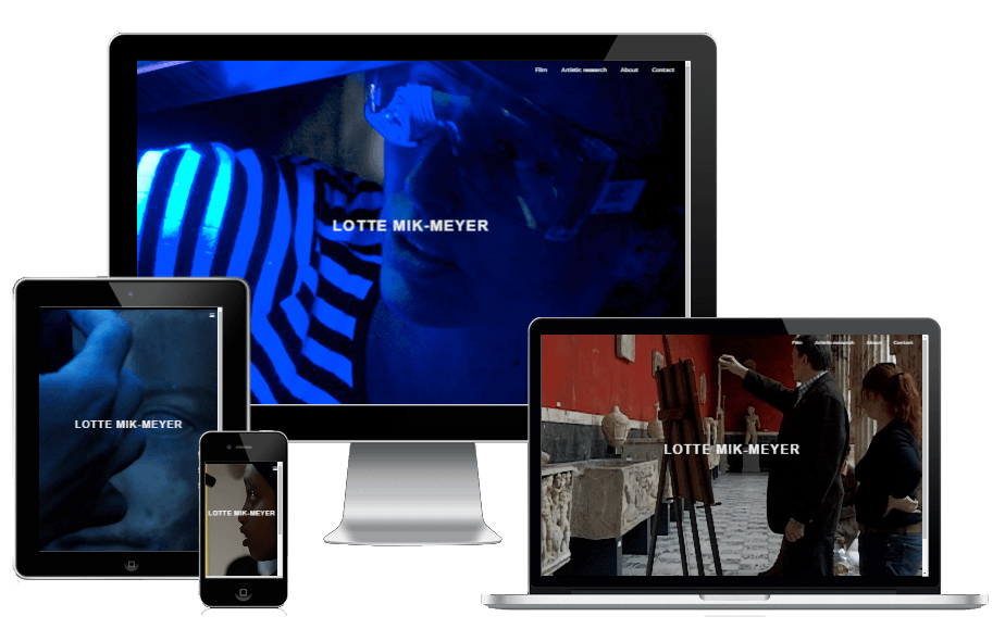
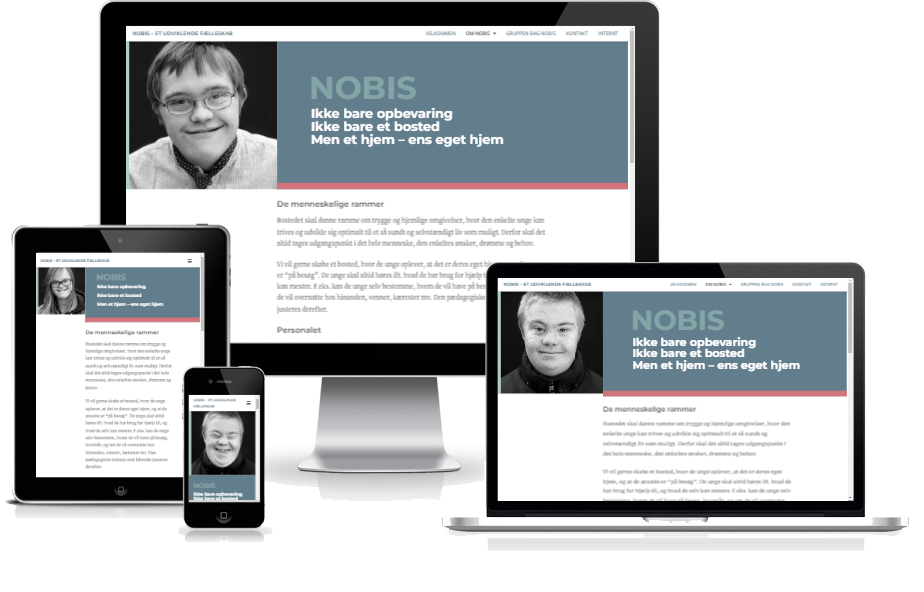
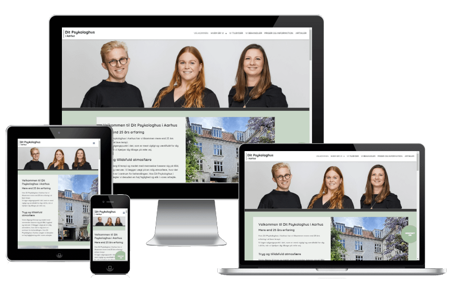
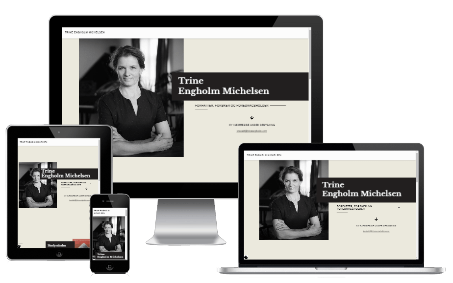

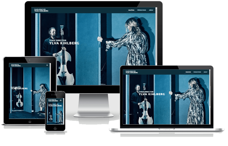
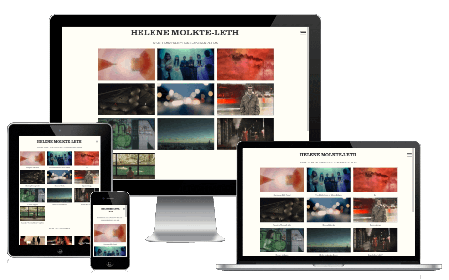
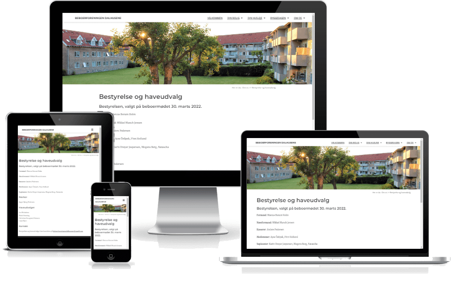
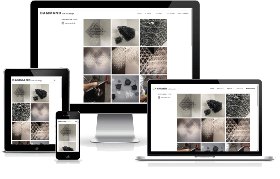
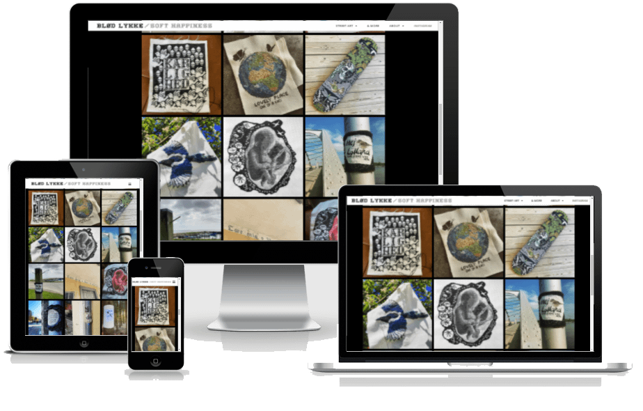
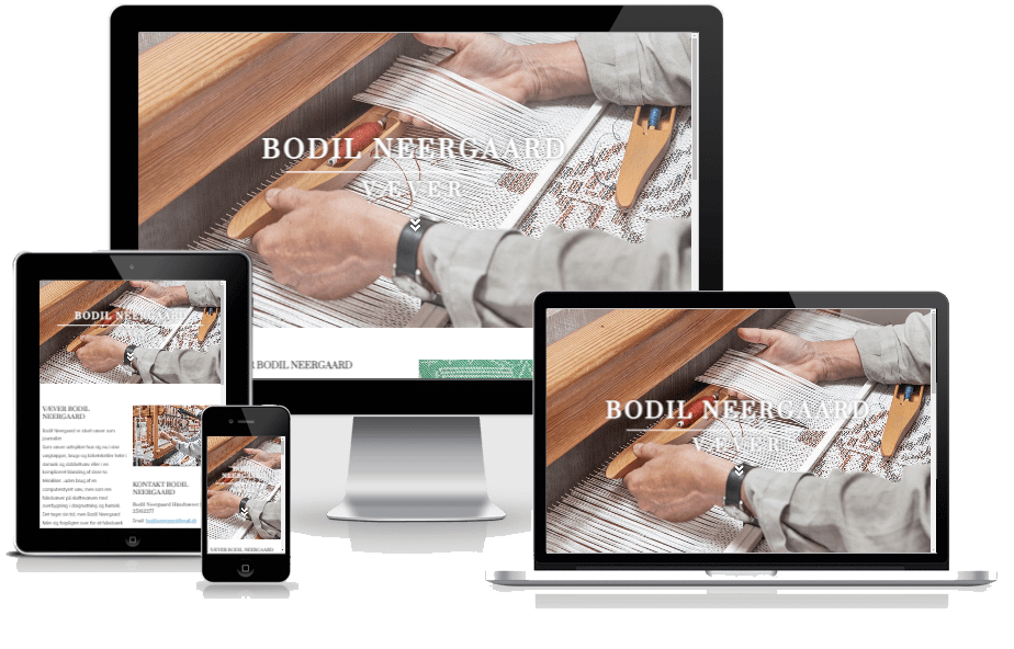
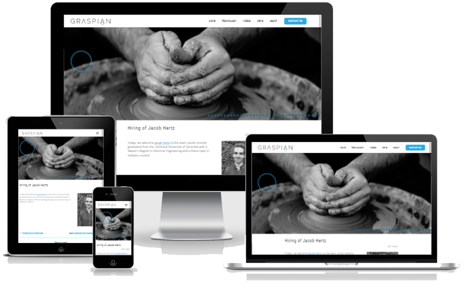
Kundecases indelt i kategorier: Psykologer og andre behandlere – Kunst og kultur – Film, TV og teater … og så alle de øvrige kunder
Har du brug for en ny hjemmeside, som er designet specielt til dig og dit firma?
Ud over at jeg afholder WordPress kurser, så designer jeg også hjemmesider til privatpersoner, enkeltmandsvirksomheder, startups og andre firmaer. Du er meget velkommen til at kontakte mig, så vi kan tale om hvilke behov du har til DIN nye hjemmeside.
Kontakt venligst Lars Bregendahl Bro – Mobil : 28 78 01 99 – E-mail :
Kommende WordPress kursus i København

WordPress kursus i København
Forår 2026
Lære at lave din egen hjemmeside i WordPress
Kursusperiode – København: 14/04 2026 – 12/05 2026
Eneundervisning tilbydes – Kontakt mig for mere info
Nye WordPress kurser under planlægning
Jeg planlægger nye kurser i København i februar 2025.
Eneundervisning tilbydes – Kontakt mig for mere info
Kommende WordPress kursus i Lyngby

WordPress kursus i Lyngby
Vinter/forår 2026
Lære at lave din egen hjemmeside i WordPress
Kursusperiode – Lyngby: 24/02 2026 – 24/03 2026
IGANGSAT – SE NÆSTE KURSUS HER
Eneundervisning tilbydes – Kontakt mig for mere info
Nye WordPress kurser under planlægning
Jeg planlægger nye kurser i København i april 2025.
Eneundervisning tilbydes – Kontakt mig for mere info